Summary
PackMinder Packing Application
UX & Visual Design | Branding
Ranging from extensive journeys to everyday purposes, Packminder encompasses a wide range of uses to alleviate frustrations caused by forgetfulness or the mislocation of crucial possessions before travel.

Design Roles
- Research
- UX Design
- Visual Design
- Branding & Identity
Deliverables
- Competitive Analysis
- User Surveys
- User Personas
- User Stories & Flows
- Paper Mockups
- Wireframes
- Usability Testing
- Logos & Style Guide
- High Fi Mockups
- Clickable Prototypes
Tools Used
- Adobe XD
- Adobe CC
- Whimsical
- Google Apps
Overview
Problems
-
Comprehensive Application Unavailable
Combining several applications for the purpose of packing can be cumbersome and unreliable.
-
Time And Reliability
Creating packing lists for certain circumstances is time consuming and can lead to items not being included in different lists.
-
Lack Of Alerts
There are no current list-making, packing or Bluetooth tracking applications that warn users when essential items have been left behind.
Solutions
-
Provide A Universal Application
A one-stop application to address packing needs would save time and lower the possibility of oversights while packing.
-
Suggest Items For Different Scenarios
Offering templates for different travel situations speeds up the process and displays items that may have been overlooked.
-
Offer Warnings
In using Bluetooth tracking technology, users can be notified that they have left behind crucial items before a departure.
Whether it be an everyday venture such as going to work, or an extended travel experience such as a vacation, forgetting to bring essential items is a common frustration for people.
While most people today use some sort of app to remind them to bring certain items, a dedicated application could further reduce forgetfulness and alleviate the aggravations of leaving important belongings behind.
Discovery
Competitive Analysis Highlights
To gain more insights into the realm of Packing applications, a full Competitive Analysis, including a SWOT analysis of 3 of the top competitors, was performed.
Most Packing applications being offered are mainly based on simple ToDo or Checklist applications with a few of them sprinkling in a bit more functionality. The following factors stand out as obstacles for these entities and could be improved upon.
Packing Pro
- UI of the app has not been updated and lacks polish
- The cognitive load can be overwhelming
- $2.99 is not exorbitant, but competitors are offering initial versions of their products for free
PackPoint
- Has several negative critics, on Amazon in particular
- Reviews state it lacks a user-friendly calendar view
- Inability to re-order the items included for packing
Tile
- Dependencies on physical products led to a lackluster application for their product
- Complaints about poor customer service
- Complaints about new pricing structure for its premium app
Key Insights
While there are several applications within the marketplace to aid forgetful users in packing belongings for departures and several applications to locate items via Bluetooth, presently, there are none within the arena that takes advantage of a combined approach.
User Research Highlights
Although the Competitive Analysis provided some insight into the realm of Packing and Tracking platforms, digging deeper required the use of a survey posted on multiple public forums including, Reddit, Slack, and others.
Responses to the survey provided critical takeaways for the development of the application.
0%
used a dedicated packing application such as Packing Pro or PackPoint.
75%
used an application on a mobile device to create a list of items needed before traveling to a destination such as work, school, a restaurant, or a vacation.
56%
of those who used a list application experienced the failure of not writing down some essential items that were needed in the list.
91%
wanted suggestions of items to bring based upon planned activities and previous entries.
86%
wanted alerts notifying them before a departure if essential items have been left behind.
86%
wanted the ability to save multiple lists for different types of events.
Key Insights
The above numbers show the possibilities of providing people with a dedicated packing application. Although there are some currently available, the marketplace is clearly unknown at this time. With proper advertising and development, an application such as this could change the way people think about packing.
User Personas
Three users with unique roles and experience levels were interviewed about their goals and frustrations when using packing, list-making or reminder applications.
The interviews and the responses from the user survey served to create the three personas shown below.

Greg The Graduate
24 Year Old College Grad
Goals
Greg would like to save lists of essential items depending upon the activity in which he is partaking. He would also like to avoid purchasing more equipment due to leaving items behind before his excursions.
Frustrations
Due to the spontaneous nature of his travels, he doesn’t have ample time to create lists of the equipment he needs for different trips.

Molly The Mom
40 Year Old Manager
Goals
Molly would like a faster, more reliable method of creating her lists of needed items. She also wants suggestions of items to include within lists based upon previous entries.
Frustrations
Failing to include some essentials within her separate lists has at several times, left Molly’s daughter without her homework. She’s also finding it difficult to manage all of her lists for different purposes.

Tina The Traveler
30 Year Old Sales Rep
Goals
She would like a smarter app that includes her previous custom items in its suggestions for packing and an alert to let her know she’s left a critical item behind before a scheduled departure.
Frustrations
Tina wastes valuable time on re-entering custom items for particular travel needs. She also cannot afford the time needed to go back for forgotten items when departing for her travels.
Information Architecture
User Stories
Using the information gathered from the Discovery and Strategy phases, user stories were compiled to demonstrate the main features of the application.
Features were prioritized according to the earlier research & developed personas into high, medium, and low priority tasks. There were also three types of user scenarios created for New Users, Returning Users and All Users.
- As a new user, I want to sign up for an account using email.
- As a user, I want to create multiple lists of items to pack for different travel plans
- As a user, I want to attach a Bluetooth tracking device to my mobile application
- As a user, I want to set time and, dates for lists according to my departure plans
- As a returning user, I want the ability to purchase upgrades for the application
Sample User Stories | Expected Outcomes omitted here due to visibility issues.
User Flows
User Stories were converted into User Flows to demonstrate how the user could interact with the product and accomplish specific tasks. These were first sketched on paper.
Development and iterations were rendered in the application, Whimsical.
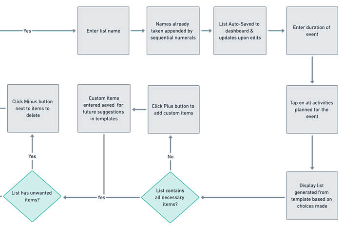
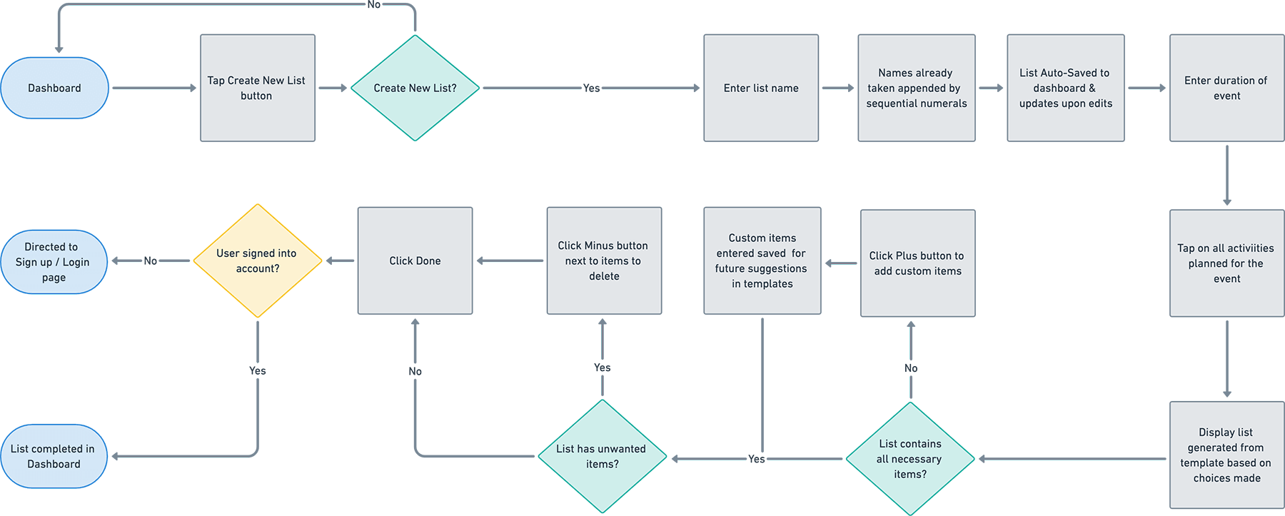
Create Packing List User Flow | Whimsical format
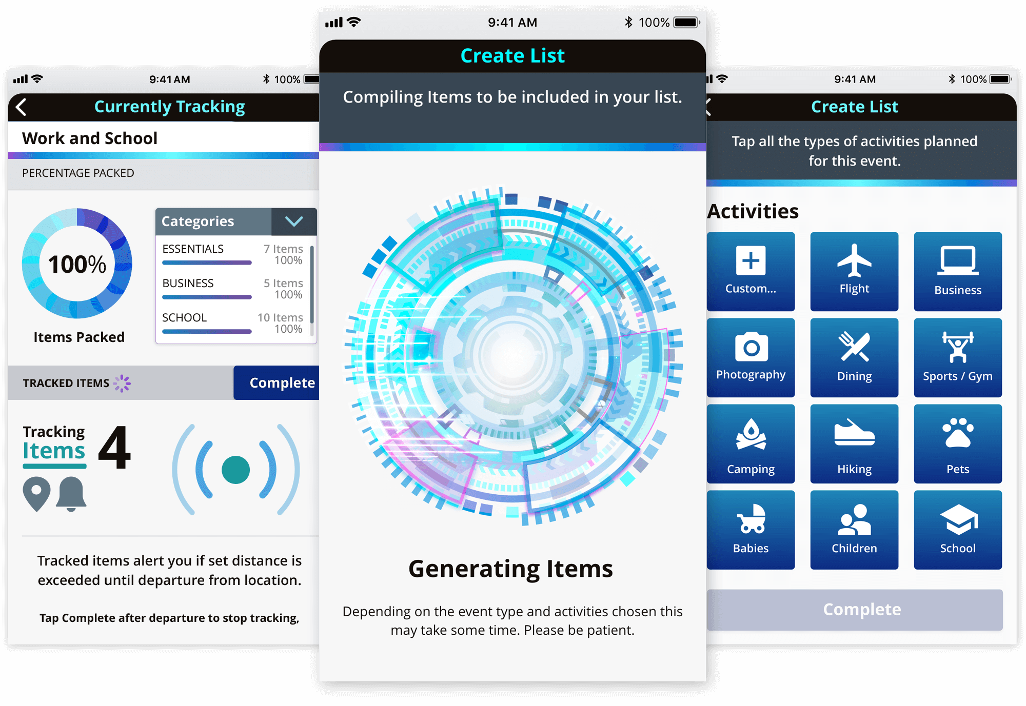
Wireframes
After establishing the user stories and flows, the skeletal structure of the application was created with pencil and paper to sketch out the rough ideas quickly.
These were transformed into low fidelity digital mock-ups and prototypes using Adobe XD.
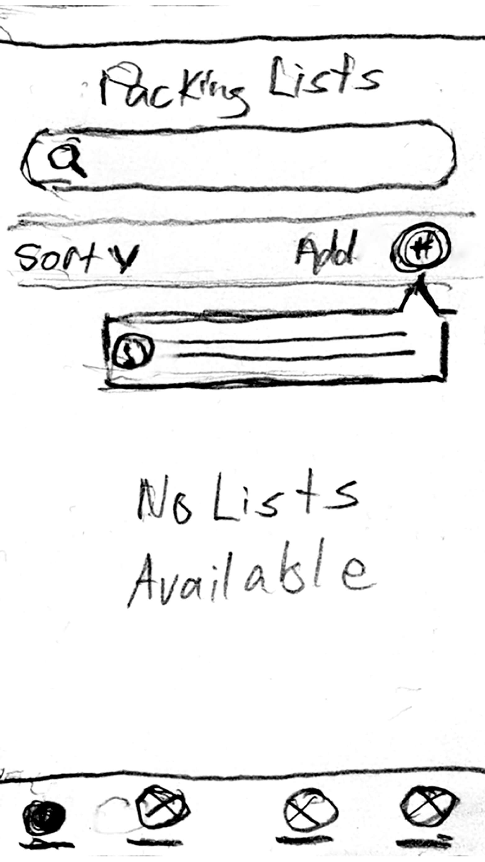
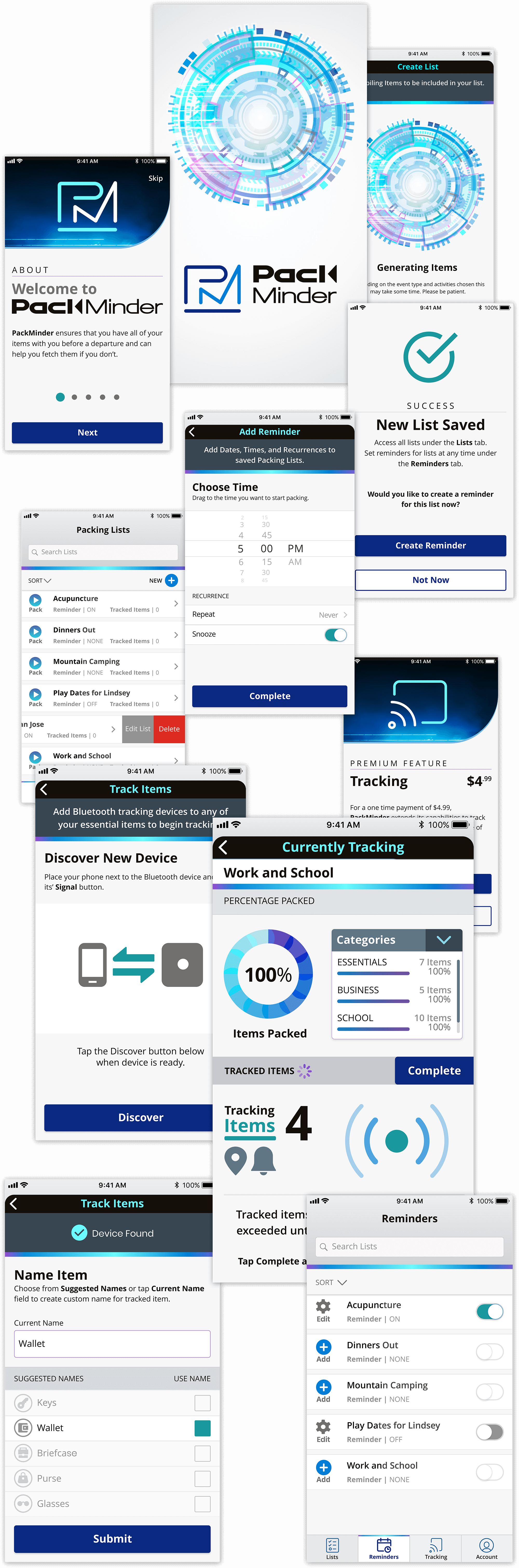
Dashboard Empty State | Hand sketched format
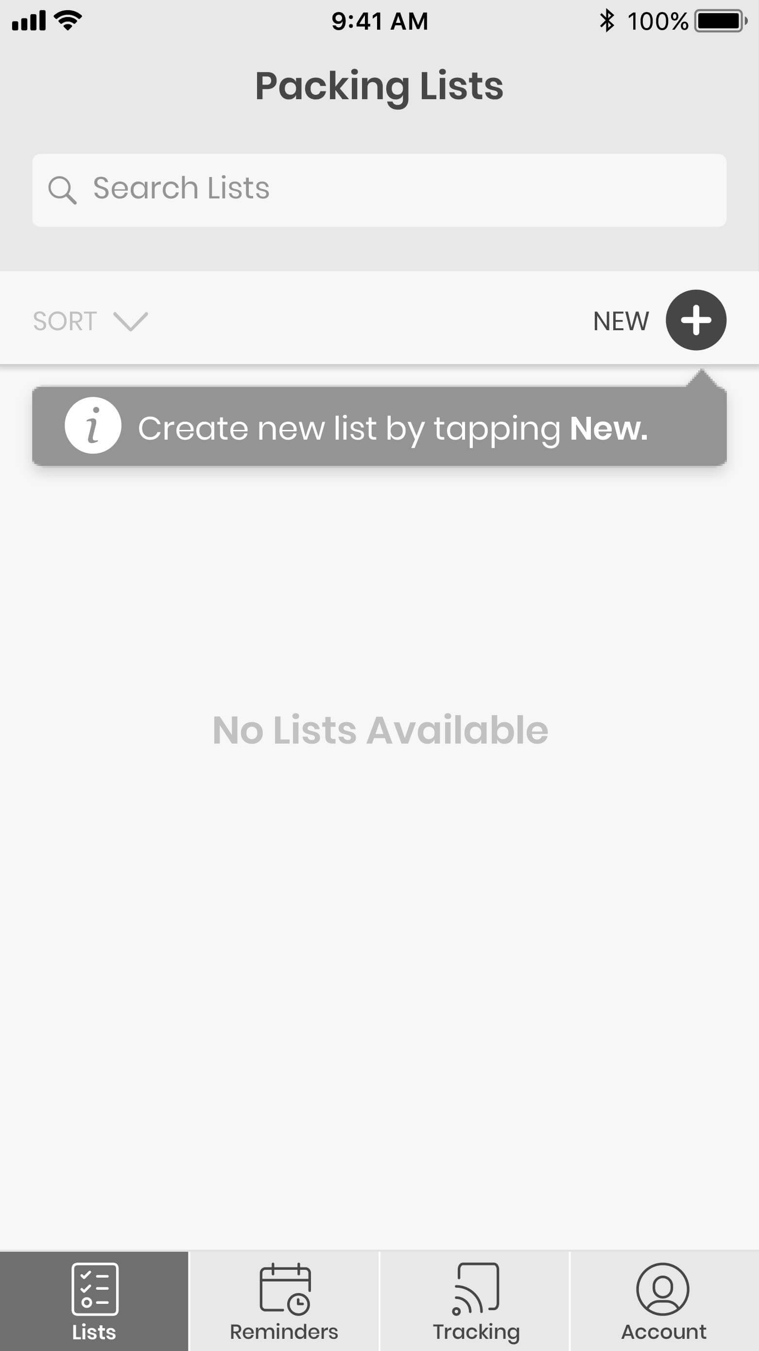
Dashboard Empty State | Created in XD
Currently Tracking | Hand sketched format
Currently Tracking | Created in XD
Branding
After establishing the functionality of PackMinder, it was time to develop the name, look, and feel for the application. See the PackMinder Style Guide for more details.
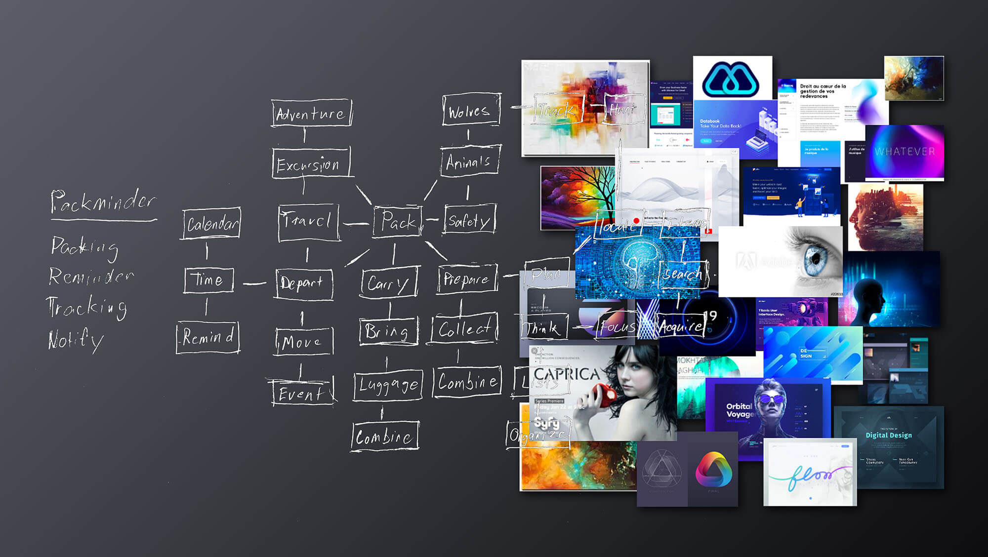
Brand Discovery | Mind Mapping, Moodboards, & research were used in the development of the logo & branding visuals.
Nomenclature
The name PackMinder was chosen as it reflects exactly what the application is intended to do. It is a comprehensive To-Do list and Reminder application that takes on aspects Bluetooth Tracking to locate tracker devices as well.
The tone of all marketing and the product itself should be clean, dynamic, and sophisticated while adding interest with vibrant colors and animations to engage users.
Logo Design
With the name established it was time to develop the logo. Sketching, iterations, & development in Adobe Illustrator brought about the final mark which is fully modular and alternates were designed for specific use cases.
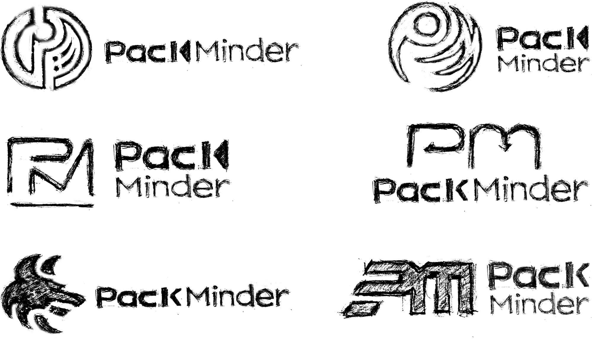
Initial Sketches | Further development in Illustrator
Final Logo Anatomy
The Icon itself is composed of the initials P and M from PackMinder. The Word-Mark is formed with a modern type style to reflect a contemporary type of application and to differentiate itself from its main competitors.
Final Main Logo | See style guide for other options and use cases
Typography
Open Sans
Open Sans was chosen for the PackMinder brand as it was optimized for print, web, and mobile interfaces, and has excellent legibility characteristics in all of its letterforms.
Open Sans also compliments the letter forms within the logo and aids in the general aesthetics of the brand which are clean, dynamic, and sophisticated.

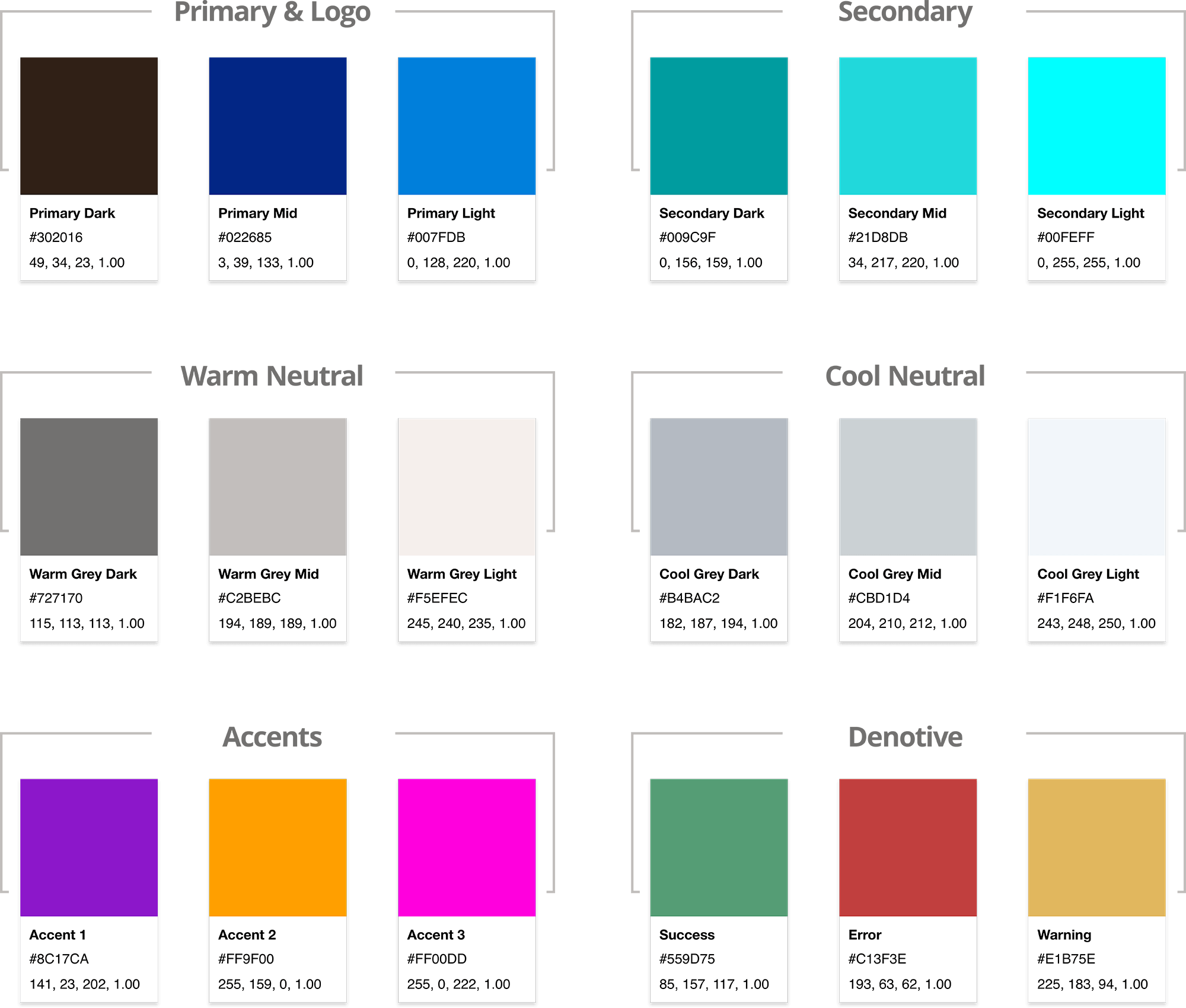
Palette
PackMinder’s palette consists mainly of an analogous palette ranging from blues to greens or teals. These colors were chosen to denote trustworthiness and also to help instill a sense of calm while packing.
Accent colors have been provided to keep the brand from feeling dull and boring. These should be used sparingly and rarely at full opacity.
Visual Design
High Fidelity Mockups
Using the PackMinder Style Guide, the wireframes were transformed into mockups displaying the branding and visual aesthetics that were developed for the product.
Preference Testing
Before moving on to creating the high fidelity prototype, there were still some options for the mockups that needed clarification as to which would be best. In-person interviews were conducted to determine the outcomes of the following questions.
CTA Buttons
Would participants find the buttons more readable with, or without the gradient?
82%
thought the text was more readable without the gradient.
Success Icon
Would participants view the checkmark icon easier without the gradient?
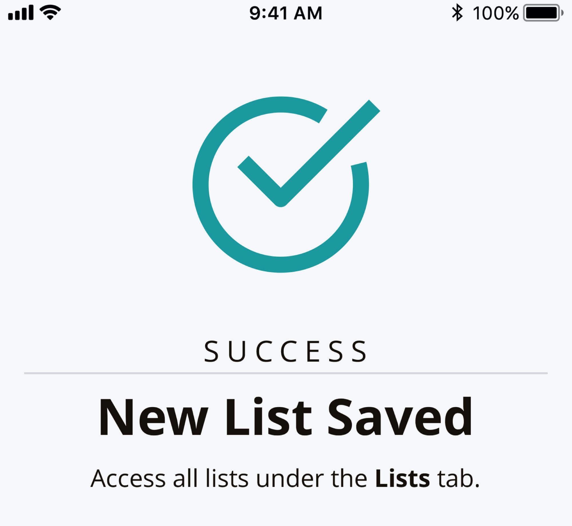
80%
thought the checkmark icon was easier to see with a flat color.
Choosing Activities
Which option would participants see as less visually distracting?
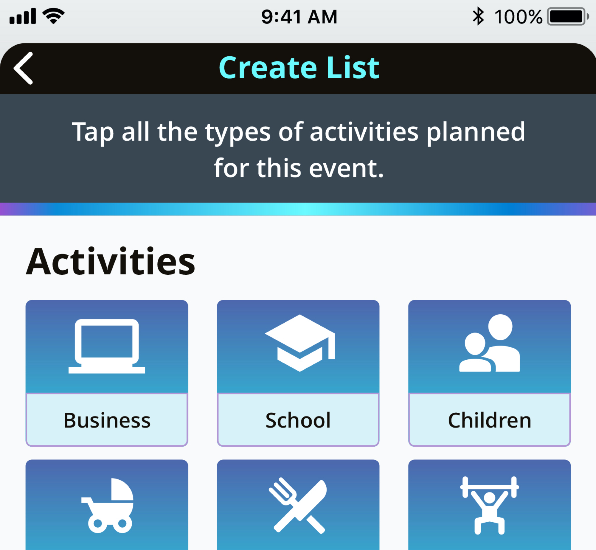
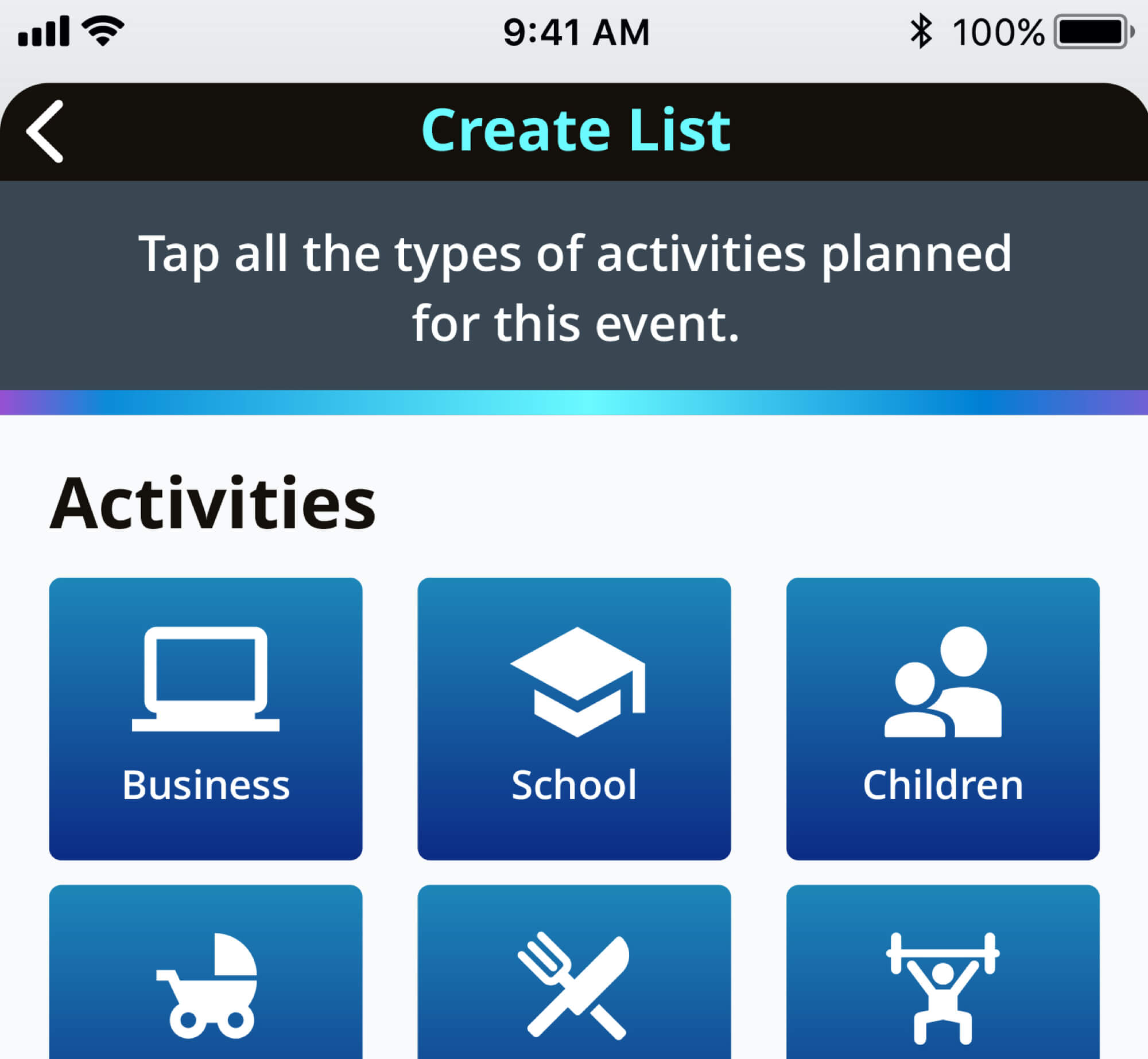
74%
found the images with the full gradient background to be less distracting.
Usability Testing Round 1
A prototype was produced and tested to find flaws in the usability of the application. For this round of testing, all three participants were tested in-person.
It’s important to note that all participants completed other tasks and testing for the benefit of the application.
Testing Conclusions
While overall the testing went well, It did bring up some issues that needed to be addressed.
- 2 of 3 users had an issue with the calendar not showing the current date.
- 2 of 3 users thought that the bottom menu had too much contrast for the selected page and found it distracting.
- 2 of 3 users struggled with choosing either the Local Outing button or the Extensive Travel Button.
Displaying an underline and changing the color helped to resolve the current date issue that users experienced
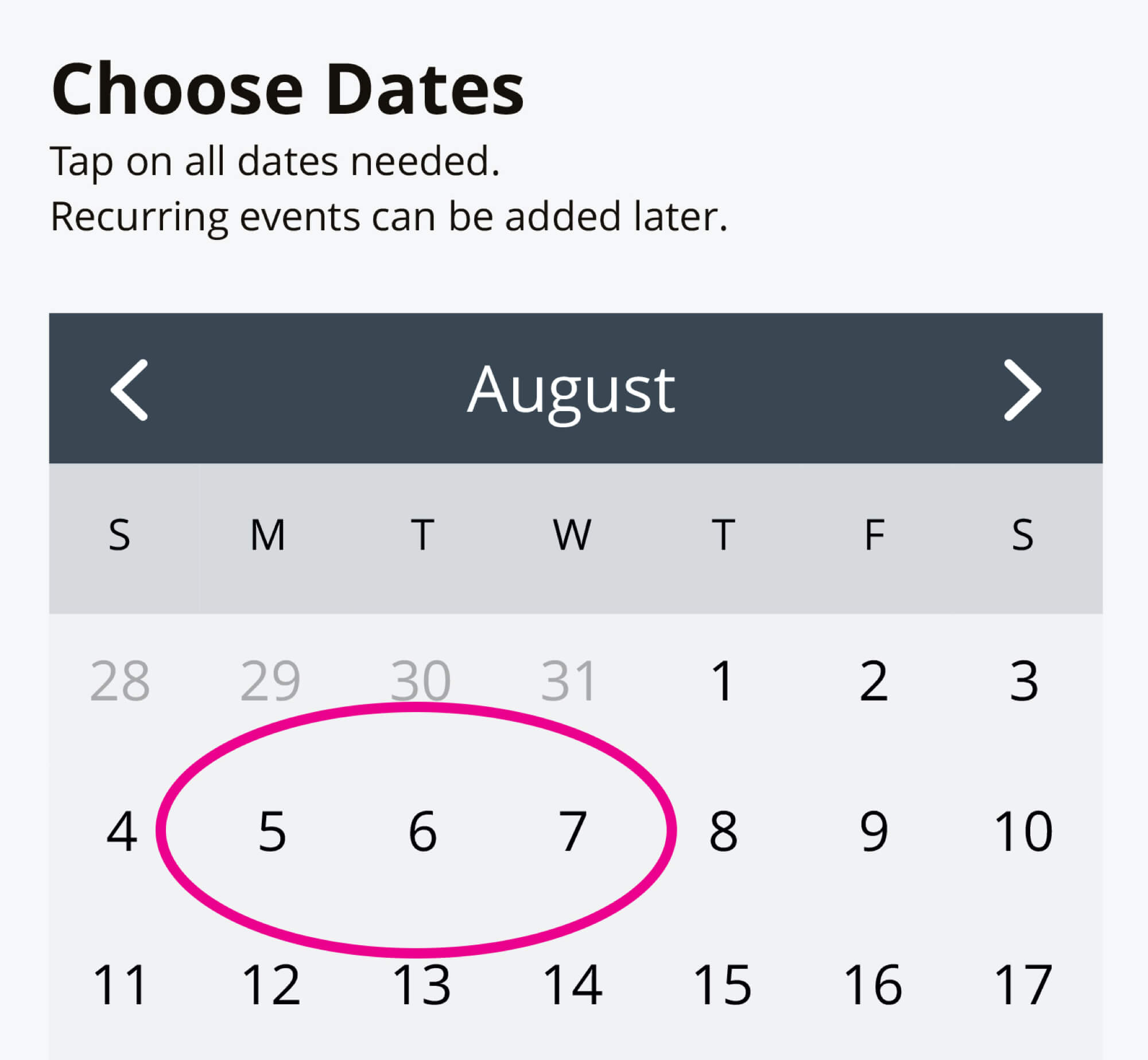
Calendar Issue | Before
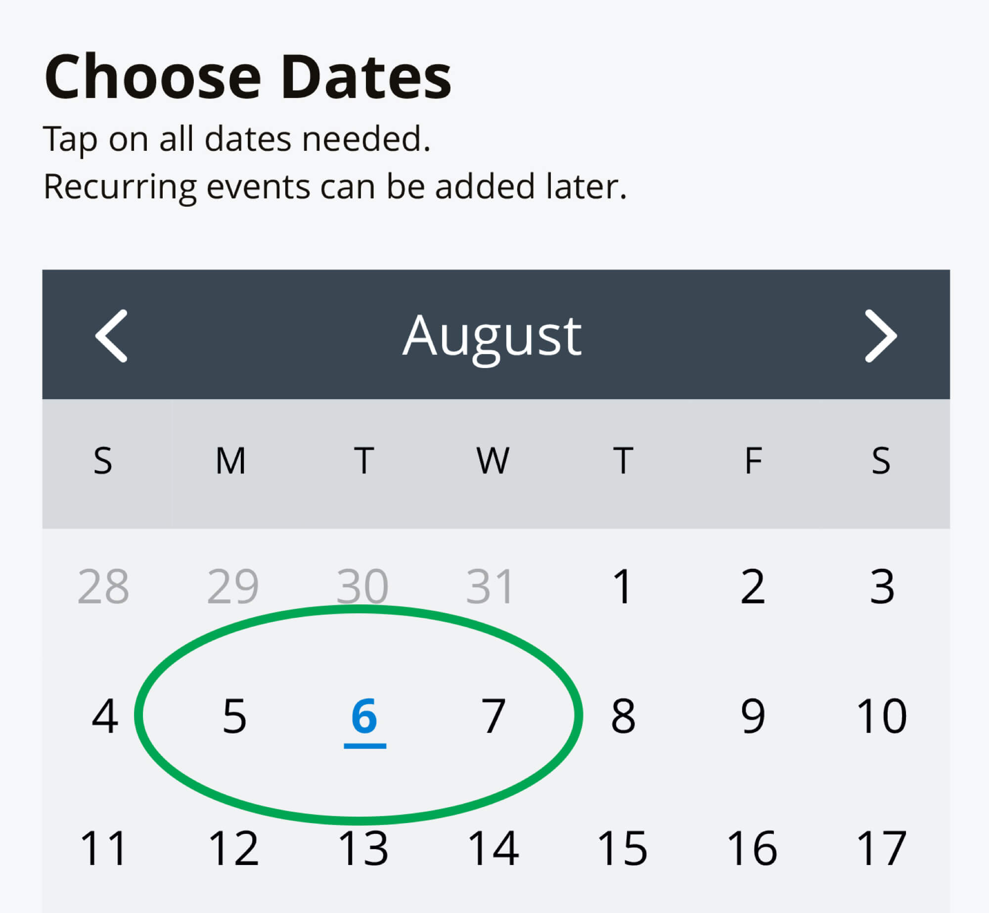
Calendar Issue | After
Changing the menu items to white instead of black for the selected state relieved the excessive contrast issue.

Menu Issue | Before

Menu Issue | After
Reducing the Event Type variables at this point would eliminate the number of clicks and options that a user needed to choose from to make a decision. Simplifying the process would make the application more efficient and understandable for users.
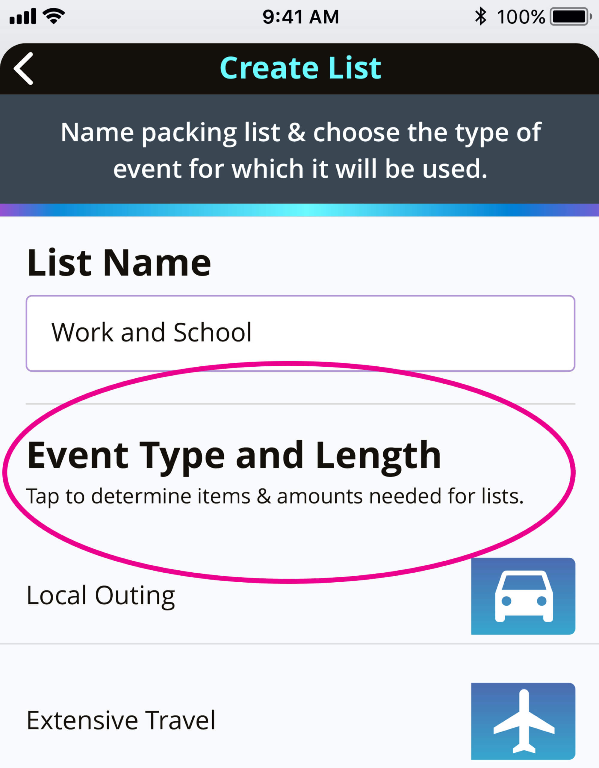
Event Type Issue | Before
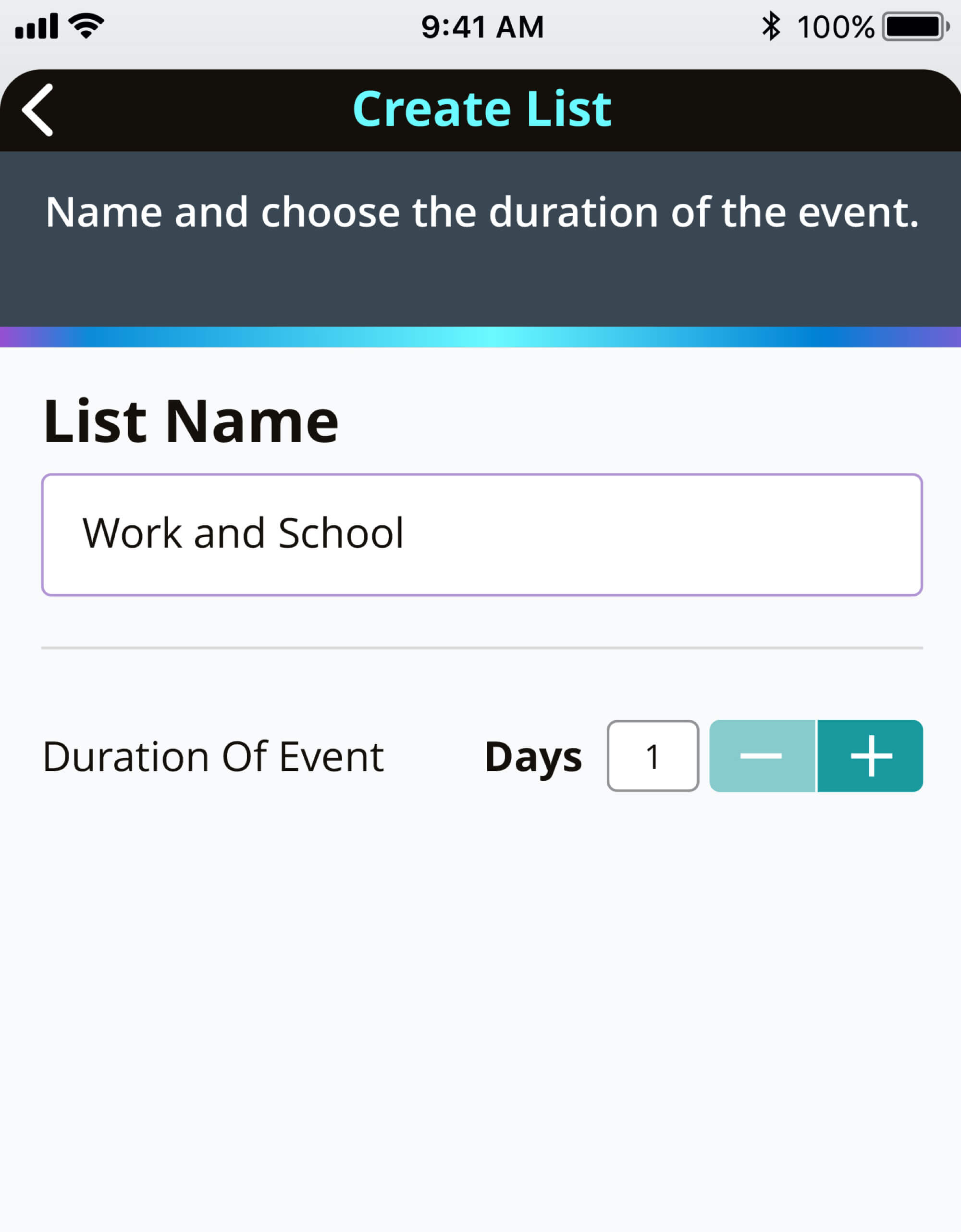
Event Issue | After
While removing the event type scenario solved most of the inherent issues within the flow, it also led to certain problems being unaddressed. Users would still need the application to suggest established items for flight or extensive travels.
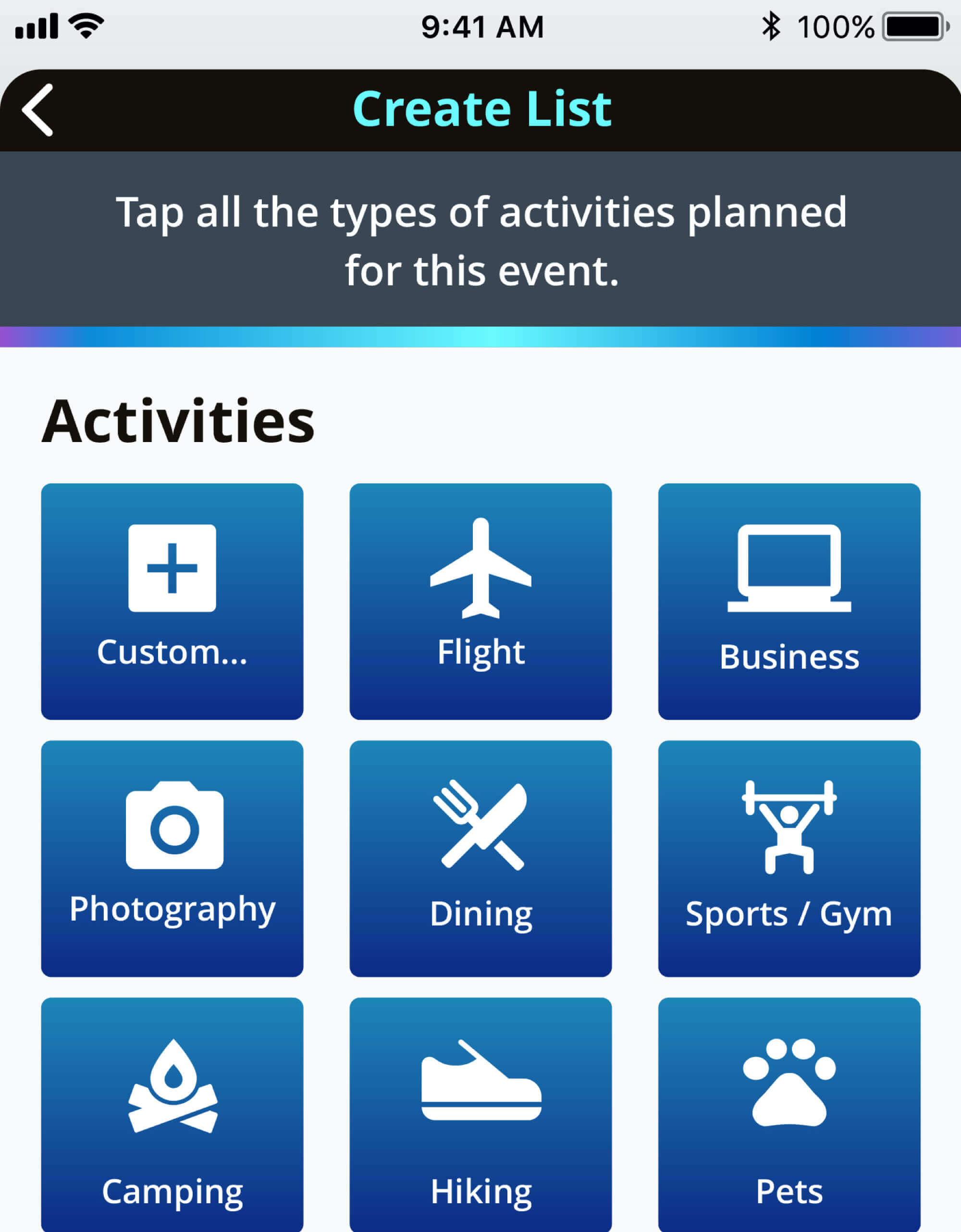
Solving this issue required including the Flight button within the activities selection menu. This way, a user could still receive list suggestions for extensive travel such as passports, etc. The Custom button was also re-located to the top of the group. This would help a user always know where to locate it even if other activities shifted.
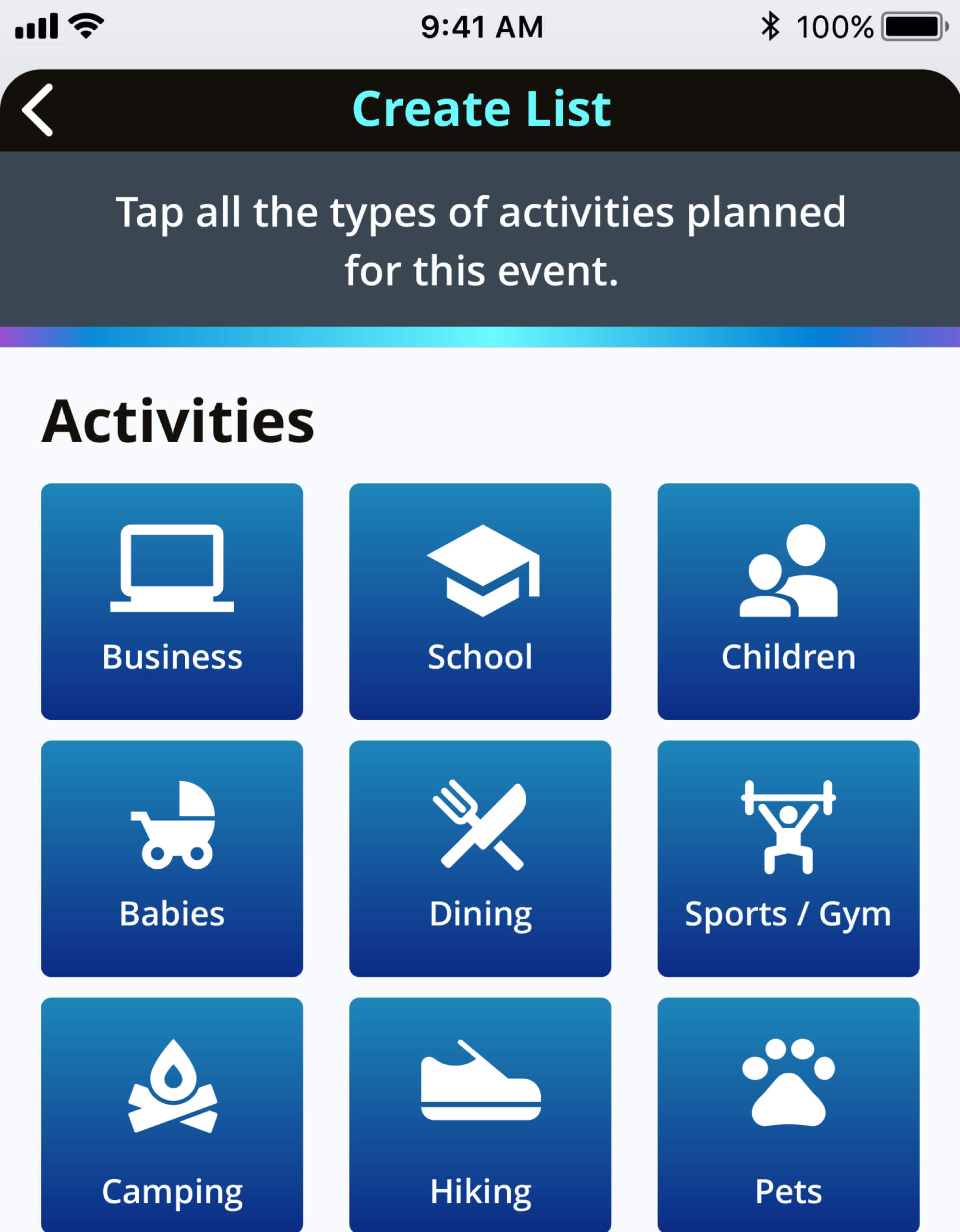
Create List Issue | Before
Create List Issue | After
Usability Testing Round 2
To verify that the changes from the previous prototype were valid, another round of user testing was conducted. This time, however, the testing was short and only focused on the Creating a List flow. All 3 of the participants were shown only the part of the prototype relating to this purpose and were tested in person.
Testing Conclusions
All 3 of the participants were able to complete the task with no issues. With the changes in place from the previous prototype, participants:
- Were no longer confused about which type of event to choose.
- Did not have to pause to read information about events.
- Were able to complete the task much more quickly and with fewer clicks than within the previous prototype.
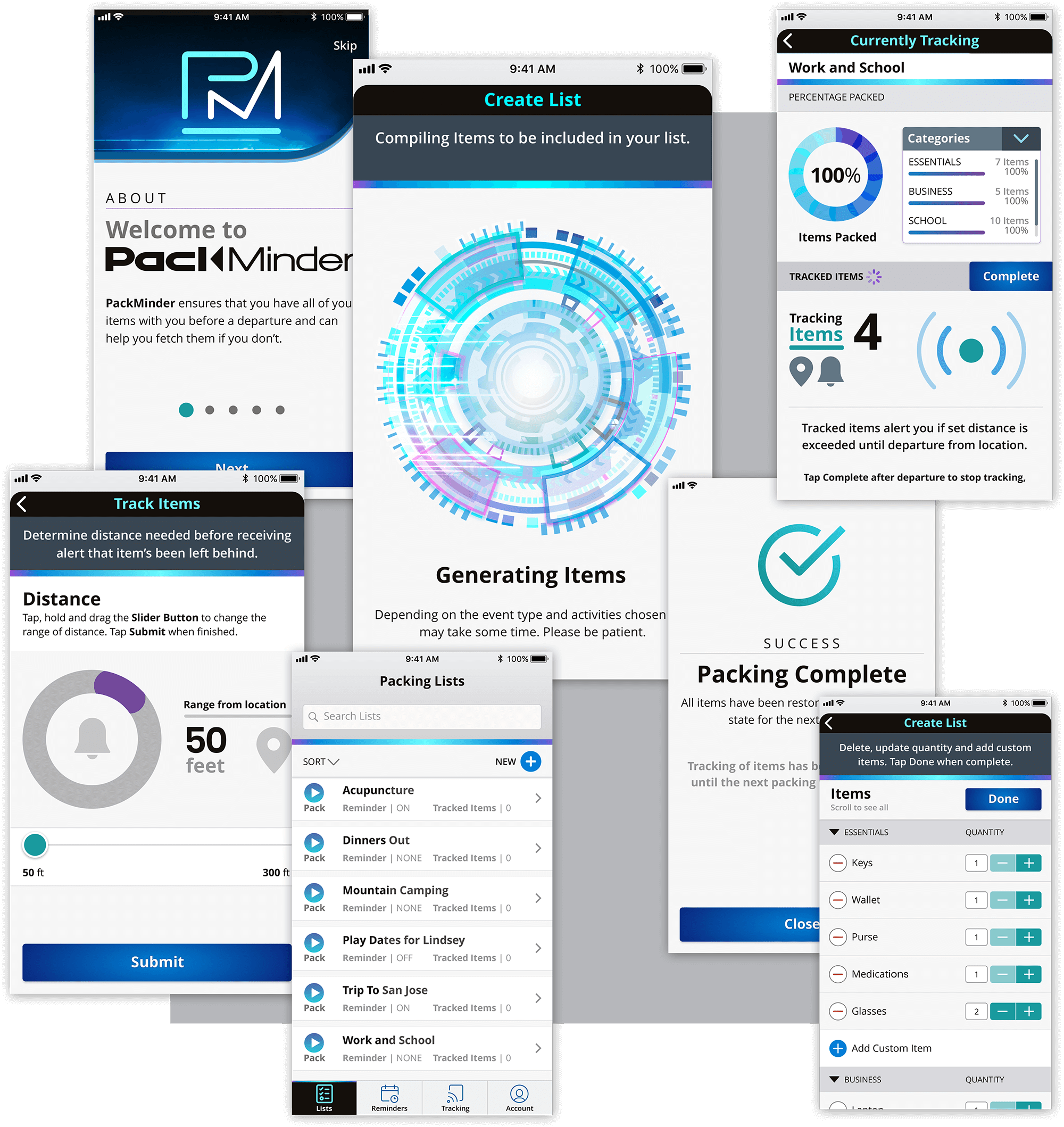
Final Design
Conclusion
Accomplishments
By supplying a designated application for packing purposes, users can save valuable time and money. By offering suggested items to bring for different circumstances, PackMinder assists its users in diminishing the time and frustrations of coming up with different packing lists for specific scenarios. With the ability to set reminders and track certain items, PackMinder also eliminates the need for users to utilize several applications to achieve their goals.
Participants within the user testing phase of the project helped to verify the accomplishments by stating that they would be highly interested in such an application for either themselves or their loved ones.
What I Learned
In utilizing an unfamiliar application for development, there is always an inherent learning curve. That was an expectation as Adobe XD was chosen to produce the prototype. However, unexpected issues arose as XD continually was offering updates within the timeframe that the PackMinder application was being designed. While these updates offered desired capabilities, they also threw some major errors into the previously set screens and animations.
There is an innate risk in updating development applications in the middle of designing or developing any project. Sometimes, it is more valuable to use an older, more stable version of an app than leaping forward to new and exciting features.